The next thing Martin Krzywinski does in this illustration is takes the middle of each circle on the printout and adds +1 to the digit and prints that associated color in the center. Then he joins double like circles and shows you what it looks like. They both make it clear that they haven’t necessarily disovered any math here, more just that it looks cool. If anything, at first glance, the pattern appears to be completely random which in and of itself is interesting.
At about 2:46 in the video there is an incredibly awesome diagram, maybe the raddest one in the series. He joins all the points of the digits in the previous circular diagram. He connected 3 to 1 then 1 to 4 then 4 to 1 and then 5 then 9 all the way through. He also associated colors with points also which makes it beautiful. If you look at the color combos it almost seems as if there is some underlying beauty with the color associations (or really the relativeness of the numbers themselves) the way celery, onions and carrots are a staple combo of many cooking dishes 🙂
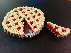
image by Bill Ward
